The premise
In this blog post we'll demonstrate...
- why CSS inherently doesn't scale
- how BEM is a partial solution
- how inline styles through JS is a (nearly) full solution
Towards the end we'll use React as a vehicle for our example, but the concepts apply equally well to Angular or any other modern JS framework. We won't use any "CSSinJS library".
A small caveat: according to many, what we're describing in this post isn't strictly CSSinJS, but inline styles via JS. However at this stage the distinction doesn't matter much, so if you came here because you're curious about CSSinJS, by all means read on!
Our example
Imagine we have a complex webapp with lots of styling. We now want to add a new UI concept; an explanation box, meant to be shown inside a bigger context to explain some related concept.
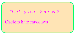
Here's what it should look like:

Disregarding styling, here's the markup:
<div>
  <h2>Did you know?</h2>
  <p>Ozelots hate maccaws!</p>
</div>
We want to apply these styles to the explanation box div:
border-radius: 15px;
padding: 10px;
border: 2px solid springgreen;
background-color: moccasin;
color: magenta;
And inside the box we want these styles for the explanation headline h2:
font-weight: normal;
letter-spacing: 5px;
padding-left: 15px;
font-style: italic;
font-size: 14px;
As an added spice, also imagine these styles being applied to every h2 in our app:
font-family: Verdana;
font-size: 16px;
Now let's start exploring how to add these styles to our markup!
Take 0 - inline styles
The most primitive solution is to simply shove all needed style rules into the style prop of every explanation box:
  <div style="border-radius: 15px; padding: 10px; border: 2px solid springgreen; background-color: moccasin; color: magenta;">
    <h2 style="font-family: Verdana; font-size: 14px; font-weight: normal; letter-spacing: 5px; padding-left: 15px; font-style: italic;">Did you know?</h2>
    <p>Ozelots hate maccaws!</p>
  </div>
This is of course a horrible solution since
- the HTML becomes super-bloated and unreadable
- the styles can't be reused
- we'd be repeating "theme rules" (like the
moccasinbackground color) all over the place
Take 1 - stylesheet with selectors
To counter the above we always put our styles in a separate CSS file, using selectors to direct where they are applied.
In order to be able to target explanation boxes we can introduce a class name to the markup:
<div class="explanationBox">
  <h2>Did you know?</h2>
  <p>Ozelots hate maccaws!</p>
</div>
In a separate CSS file we can now apply the box styles like this:
.explanationBox {
  border-radius: 15px;
  padding: 10px;
  border: 2px solid springgreen;
  background-color: moccasin;
  color: magenta;
}
We style the explanation headline by using a child combinator in the selector:
.explanationBox > h2 {
  font-weight: normal;
  letter-spacing: 5px;
  padding-left: 15px;
  font-style: italic;
  font-size: 14px;
}
The generic h2 styles would get their own selector:
h2 {
  font-family: Verdana;
  font-size: 16px;
}
Note that both of these later selectors will have an opinion about the font-size of our explanation headline, but since .explanationBox > h2 is more specific than h2, the former will win.
Unanswerable question 1 - the unknown killer problem
With our styles in a CSS file, we now have the following situation:
The rule blobs are connected with their respective target elements via selectors. While they work fine for our simple example, they don't scale well. As the app grows it is very easy to end up in a messy situation where we are scared to change both HTML and CSS, in fear of some selector somewhere breaking.
Even in our small example the main reasons for the unscalability are easy to demonstrate.
Look again at our HTML...
<div class="explanationBox">
  <h2>Did you know?</h2>
  <p>Ozelots hate maccaws!</p>
</div>
...and ponder this simple question with regards to the div:
What styles are applied to this element?
We have no easy way of knowing! The elements are being shot at by CSS selectors somewhere out there in the dark. From this side we have no idea whether any of them are targetting this specific element.
It is likely that there is a selector targetting the .explanationBox class in a selector somewhere. But because CSS selectors are global we'd have to search all CSS in order to know.
And consider asking the same question about the h2 - it doesn't have a class, which might imply it is not in the crosshairs, but it is in fact targeted by two selectors; h2 and .explanationBox > h2.
Just by looking at the HTML we cannot know what styles, if any, are applied to an element.
Unanswerable question 2 - the unknown victim problem
We find the reverse of the same problem in the CSS file. Look for example at this part:
.explanationBox > h2 {
  font-weight: normal;
  letter-spacing: 5px;
  padding-left: 15px;
  font-style: italic;
  font-size: 14px;
}
Now imagine trying to answer this question:
To which elements are these styles applied?
This is impossible to know. We'd have to search through all our HTML files, or templates in case of a dynamic app. And in a dynamic setting the .explanationBox element and the contained h2 might live in completely different places, making it even harder to figure out the answer.
This makes editing a CSS file really scary. Can we remove this part? If the question above was easy to answer then we could know whether it is safe to remove a certain part, but now we cannot!
Take 2 - using the BEM naming convention
There has been many attempts to mitigate the mess caused by the inability to answer these two questions. One such attempt is the BEM naming convention, which basically boils down to...
- have selectors consist of a single class always
- name the classes according to a strict convention
For our example, the explanation box would be a Block, while the h2 inside of that would be an Element of that block. This is the B and E of BEM (the M stands for modifier but we don't need that here).
Using BEM logic our markup would become:
<div class="explanationBox">
  <h2 class="explanationBox__headline">Did you know?</h2>
  <p>Ozelots hate maccaws!</p>
</div>
The CSS would now be:
h2 {
  font-family: Verdana;
  font-size: 14px;
}

.explanationBox {
  border-radius: 15px;
  padding: 10px;
  border: 2px solid springgreen;
  background-color: moccasin;
  color: magenta;
}

.explanationBox__headline {
  font-weight: normal;
  letter-spacing: 5px;
  padding-left: 15px;
  font-style: italic;
}
It is now slightly more clear what styles are applied where. Both the earlier questions are easier to answer, since we can do a search for the more precise class names.
But we still have the problem of the generic h2 selector. Also class names might be dynamically created and/or added to an element, so again, in a dynamic setting it might still be hard to find out exactly what's going on.
Take 3 - inline styles in a React component
The basic idea in BEM, as well as in OOCSS or any of the other attempts at bringing structure to CSS, is to think in terms of components. All style definitions, as far as possible, should be tied to a certain component.
This jives very well with modern JS frameworks, who (almost) all have a component-centric architecture. If components are our main abstraction, then it is very easy to make an API to style individual components.
React (and most of the competition) does this by letting us provide a CSS-like JS object to the style prop:
const box = {
  borderRadius: "15px",
  padding: "10px",
  border: '2px solid springgreen',
  backgroundColor: 'moccasin',
  color: 'magenta'
};

const headline = {
  fontFamily: 'Verdana', // should live in generic h2 styling, but we're cheating for now
  fontWeight: "normal",
  letterSpacing: "5px",
  paddingLeft: "15px",
  fontStyle: "italic",
  fontSize: '14px'
};

export class ExplanationBox extends React.Component {
  render() {
    return (
      <div style={box}>
        <h2 style={headline}>{this.props.title}</h2>
        {this.props.children}
      </div>
    );
  }
}
Elsewhere in our React app we can now do this...
<ExplanationBox title="Did you know?">
  <p>Ozelots hate maccaws!</p>
</ExplanationBox>
...and we have our reusable, styled component!
Take 4 - imported inline styles
However, what you just saw was really nothing but a regression to our Take 0 attempt, where we put all styles inline. Like an animal.
But we can improve on this super easily, simply by migrating the styles to a separate file! Imagine the following living in a file named styles.js:
export const typography = {
  h2: {
    fontFamily: 'Verdana',
    fontSize: '16px'
  }
};

export const explanation = {
  box: {
    borderRadius: "15px",
    padding: "10px",
    border: '2px solid springgreen',
    backgroundColor: 'moccasin,
    color: 'magenta',
  },
  headline: {
    ...typography.h2
    fontWeight: "normal",
    letterSpacing: "5px",
    paddingLeft: "15px",
    fontStyle: "italic",
    fontSize: '14px'
  }
};
Note the handling of the basic h2 styles!
Our React component now becomes this:
import {explanation} from styles;

export class ExplanationBox extends React.Component {
  render() {
    return (
      <div style={explanation.box}>
        <h2 style={explanation.headline}>{this.props.title}</h2>
        {this.props.children}
      </div>
    );
  }
}
We have now sort of reinvented the stylesheet! Except, where before the stylesheet used selectors to fire blindly into the dark...
...we now let the components go get exactly the styles they need via imports:
It might not be immediately obvious, but the flipping of this arrow makes a world of difference!
Finding the killer
Remember the first unanswerable question?
What styles are applied to this element?
In our imported inline style setup, this becomes trivial to answer. I simply follow the thread backwards from the style prop!

Finding the victim
Our second unanswerable question was:
To which elements are these styles applied?
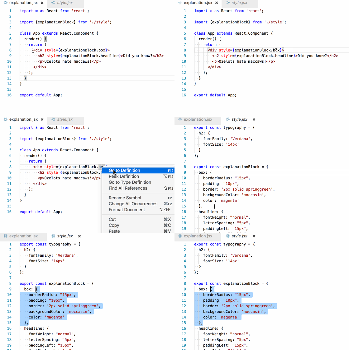
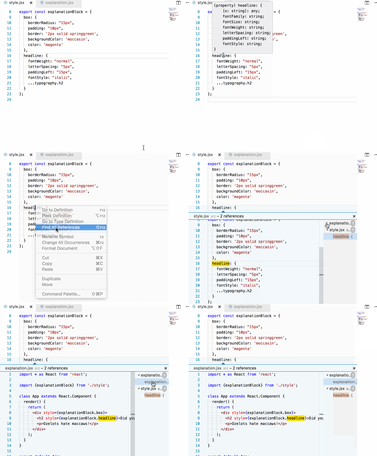
Again, because of the explicit imports, this becomes very easy to answer (if you have a semi-competent editor):

LESS isn't more
Through moving our style definitions to JS land, the need for CSS preprocessors goes out the window. Remember how we used the ... spread operator to mix in the h2 styles into our headline rules?
headline: {
  ...typography.h2
  fontWeight: "normal",
  letterSpacing: "5px",
  paddingLeft: "15px",
  fontStyle: "italic",
  fontSize: '14px'
}
That was the equivalent of a LESS/SASS mixin! You'll quickly find that the other syntax they give us can be easily replicated with pure JS. For example, having global variables becomes trivial:
export const palette = {
  softcolor: 'moccasin',
  hardcolor: 'magenta',
  accentuationcolor: 'springgreen'
}

export const explanationBlock = {
  box: {
    borderRadius: "15px",
    padding: "10px",
    border: '2px solid ' + palette.accentuationcolor,
    backgroundColor: palette.softcolor,
    color: palette.hardcolor,
  },
  // ...truncated
As do implementing helper functions to add vendor prefixes, saturate colours, etc.
Wrapping up
To recap; by turning the arrows around through using JS and inline styles, almost all opaqueness of regular CSS goes away. Previously difficult tasks such as...
- renaming a CSS class
- identifying and removing dead CSS code
- hitting the correct elements with selectors
- NOT hitting the wrong elements with selectors
...suddenly become easy or entirely moot.
While there are still a lot of questions to be answered regarding moving CSS to JS space, there's no doubt in my mind that just being able to flip the arrow of responsibility makes it all worth it.
One of the primary downsides of inline JS styles is that we can't use pseudoselectors such as :hover or @media. I hope to show how we can get around that using helper libraries in an upcoming post.